This post may contain affiliate links and I may earn a small commission, at no extra cost to you. When you use one of my affiliate links, the company compensates me, which helps me run this blog. Read my Privacy Policy for more information.
Have you ever walked into a home and felt instantly calm, like everything just goes together—even if the decor isn’t your style? That’s the magic of a cohesive color palette. It creates flow, balance, and makes every room feel intentional. If your house feels a little disjointed right now (hello, random blue bathroom next to a taupe hallway), don’t worry. You’re not alone—and you’re definitely not stuck with it.
Creating a whole house color palette might sound intimidating, but I promise it’s one of the easiest and most impactful things you can do to elevate your home’s design. In this post, I’ll walk you through how to build a beautiful palette that works for your home—from understanding color theory to picking your dominant and accent colors, and tying it all together in a way that feels effortless.
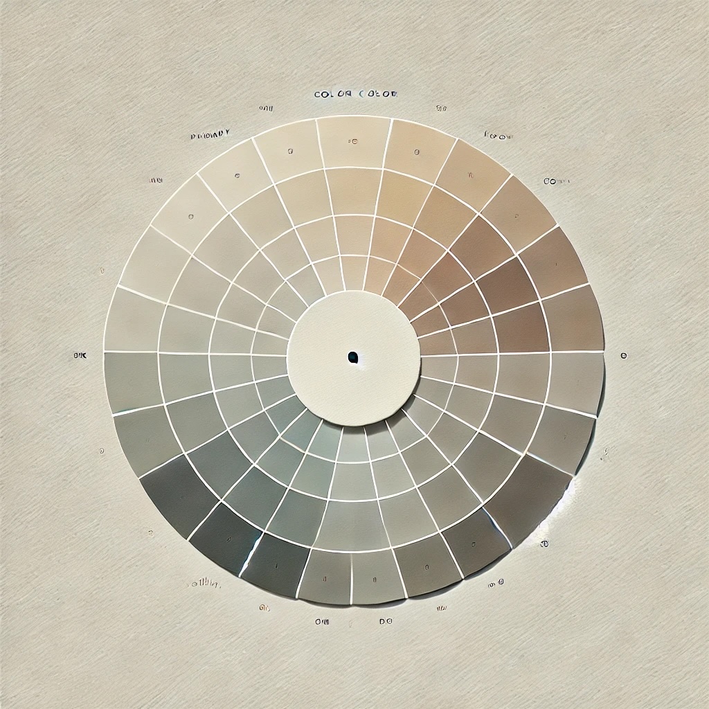
Understanding Color Theory (Don’t Worry—This Isn’t Art Class)
Okay, I know “color theory” might sound like something you left behind in a high school art room, but stick with me—this stuff matters!
There are three key things to understand about color:
• Hue: This is basically the name of the color—blue, green, red, etc.
• Value: This refers to how light or dark a color is.
• Saturation: This is the intensity of the color—think soft muted sage vs. bold emerald green.
Now, there are different types of color schemes that designers use all the time:
• Complementary: Opposite colors on the color wheel (like blue and orange) for contrast.
• Analogous: Colors next to each other on the wheel (like blues and greens) for harmony.
• Neutral: Whites, creams, tans, and grays—your best friends for timeless, grounding spaces.
Understanding these relationships helps you make intentional choices that feel right, even if you’re not consciously thinking about why they work.
Choosing a Dominant Color (This is Your Home’s “Main Character”)
This is where the fun begins! The dominant color will act as the anchor for your palette—it’s the hue you’ll use most often, especially on your walls and larger furniture pieces.
Ask yourself:
• What mood do I want my home to have? (Calm = cooler tones; cozy = warmer tones)
• What direction do most of your rooms face? (North = cooler light; South = warmer light)
• What colors make you feel good?
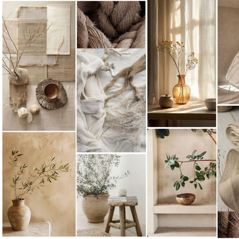
Personally, I leaned into warm, earthy neutrals because they play so well with natural textures and wood tones—which I love to incorporate. I started with a soft, greige tone with warm undertones as my foundation and built from there.
Don’t stress about picking one perfect shade—instead, choose a general color family and test a few swatches in different rooms and lighting before committing.

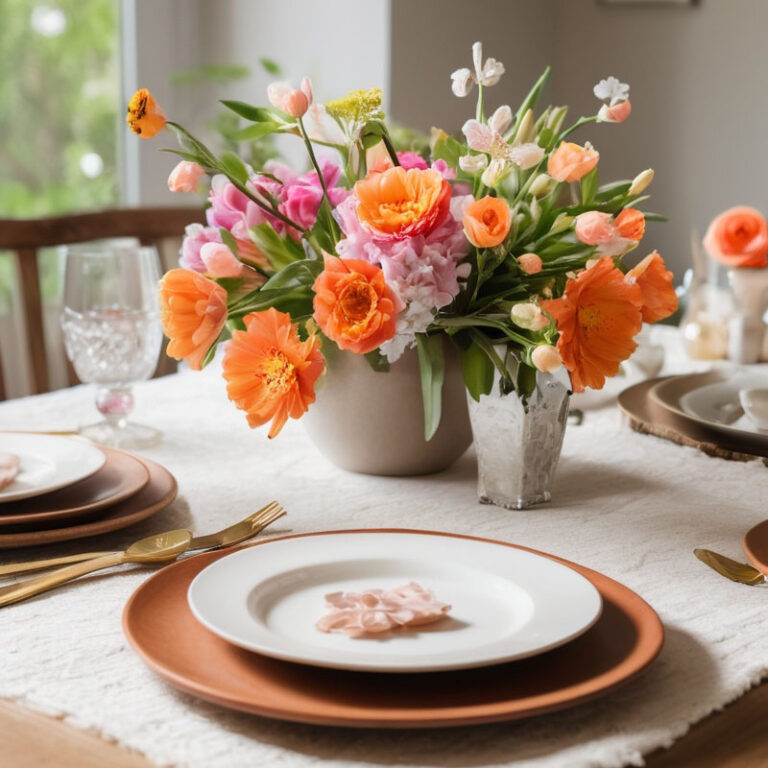
Selecting Accent Colors (The Spice Rack of Your Home’s Palette)
Once you’ve chosen your main character, it’s time to cast your supporting roles. Accent colors are the hues that add interest, depth, and personality.
A few tips:
• Stick to 2–3 accent colors to keep things cohesive.
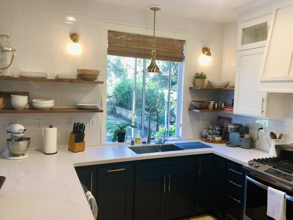
• Consider choosing a bold color for moments of drama (think: navy blue cabinets or a rust-colored sofa).
• Include subtle accent tones that can be used in throw pillows, art, and textiles.
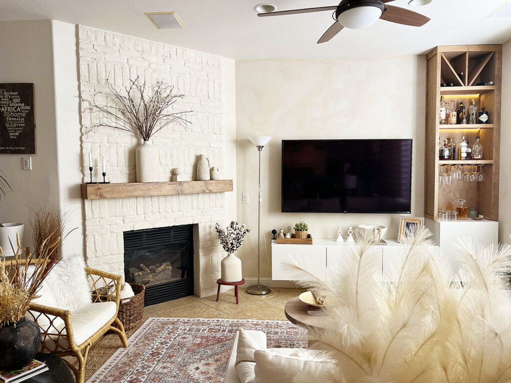
I used a navy blue and wood tones throughout my home as accents—they add just enough warmth and color while still playing nicely with my warm neutral base. Plus, they work with both modern and organic textures, which are kind of my thing.
Creating Balance and Flow
Now that you have your main and accent colors, it’s time to distribute them strategically.
Enter the 60-30-10 rule—a classic designer trick:
• 60%: Your dominant color (walls, big furniture)
• 30%: Secondary color or accent (smaller furniture, curtains, rugs)
• 10%: The “pop” of bold accent color (pillows, art, accessories)
Use this ratio loosely, not rigidly. The goal is to create visual flow from room to room so nothing feels jarring or out of place. One way to do this is to repeat the same colors throughout your home, but in different applications.
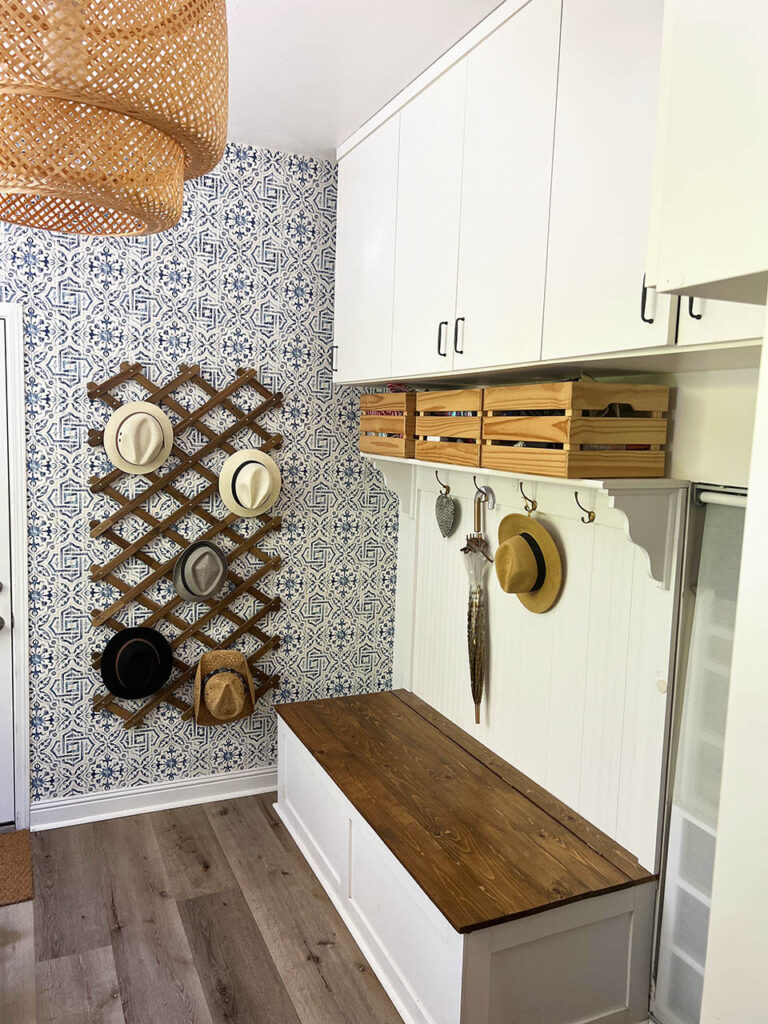
For example, I used my navy blue wallpaper in the mudroom adjacent to kitchen, and wood tones throughout the living room. It creates rhythm and subtle repetition without being too matchy-matchy.
Putting It All Together
Here’s how to build your whole house palette step-by-step:
1. Start with your dominant color: Sample 3–5 swatches and view them in morning, afternoon, and evening light.
2. Choose 2–3 accent colors: Use complementary or analogous schemes to guide you.
3. Pick a neutral or two: These are your balance points—great for trim, cabinetry, and background pieces.
4. Test in multiple rooms: What looks great in the bedroom might feel off in the kitchen. Be flexible.
5. Repeat your colors in subtle ways: Think textiles, decor, and even indoor plants or flowers!
Don’t forget texture—it’s the unsung hero that brings a color palette to life. A warm greige wall with linen drapes, a jute rug, and a leather chair feels way more layered than just a flat beige room.
Final Thoughts
Creating a whole house color palette isn’t about making every room identical—it’s about curating a home that feels collected, intentional, and harmonious. With a little bit of planning and a lot of trust in your gut, you’ll be amazed at how much more elevated your home feels.
Remember:
• Use color theory as your guide
• Choose one main color that sets the tone
• Pick accents that add depth and personality
• Create flow using the 60-30-10 rule
• Have fun—this is your home!